
Ensuring your Dashboards look great on both desktop and mobile devices is essential. The Seer Data Dashboard editor offers built-in tools that let you control how your design appears on different screen sizes, especially on mobile phones.
What is Mobile Responsiveness?
Mobile responsiveness means your content automatically adjusts its layout, fonts, images, and visibility to fit smaller screens like smartphones and tablets, improving readability and usability.
How to Use Mobile Responsiveness Controls in Dashboards
1. Toggle Between Desktop and Mobile Views
-
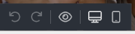
Locate the Mobile/Desktop toggle in the editor’s bottom toolbar — it looks like a smartphone icon.
-
Click this icon to switch the canvas between Desktop view and Mobile view.
-
Mobile view simulates how your design will look on small screens, letting you see and edit it specifically for mobile users.
2. Edit Mobile-Specific Styles
-
When you are in Mobile view, select any block on your design.

-
Use the right sidebar to adjust styling that applies only to mobile, such as:
-
Font size and line height
-
Padding and margins
-
Background colors or images
-
Alignment and layout tweaks
-
-
These changes do not affect the desktop version, allowing you to optimise separately.
3. Control Block Visibility and Display on Mobile
-
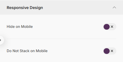
With a block selected, find the Responsive Design option in the right sidebar.
-
You can toggle whether a block is:
-
Visible on Desktop only
-
Visible on Mobile only
-
Visible on Both
-
-
This feature lets you hide complex or large elements on mobile to keep the design clean and fast.
- Where you have selected a row, you can toggle whether its contents stack on mobile or whether they should remain side by side.
4. Preview Your Responsive Design
-
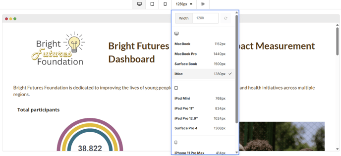
Use the Preview button (
 ) in the bottom toolbar: this view allows you to test how your Dashboard will display on devices with custom dimensions or select from a larger list of devices.
 -
Switch between desktop and mobile previews to check your design.
-
Make final tweaks as needed to ensure a seamless experience on all devices.
5. Best Practices for Mobile Optimisation
-
Simplify layouts on mobile: use fewer columns and stack content vertically.
- Customise rows for each view
If you have a complex multi-column layout for desktop, duplicate it and create a simplified, stacked version for mobile. Then use visibility settings so only the correct version shows on each device. -
Increase font sizes for readability on smaller screens.
-
Adjust padding and spacing to ensure elements are not cramped.
-
Hide or replace large images that may slow loading or clutter the mobile view.
-
Test regularly by toggling between desktop and mobile views.
-
Use the preview function to see how your design appears on different devices before finalising.
Summary
Seer Data Dashboard's mobile responsiveness tools give you full control to create designs that look professional and work perfectly on any screen size. By using the mobile toggle, editing mobile-specific styles, and managing visibility, you can optimise your emails or Dashboards for the best user experience everywhere.