
When to use a Horizontal bar stacked chart
This format is ideal when you need to:
-
Show how multiple values contribute to a total within each category.
-
Visualise part-to-whole relationships using a horizontal layout.
-
Work with longer category labels that are easier to read left to right.
-
Compare both overall totals and individual segments across different groups.
How to build a Horizontal bar stacked chart
-
In the Explore Data tool, go to the Build your chart step.
-
Under the Type tab, select Horizontal bar stacked.

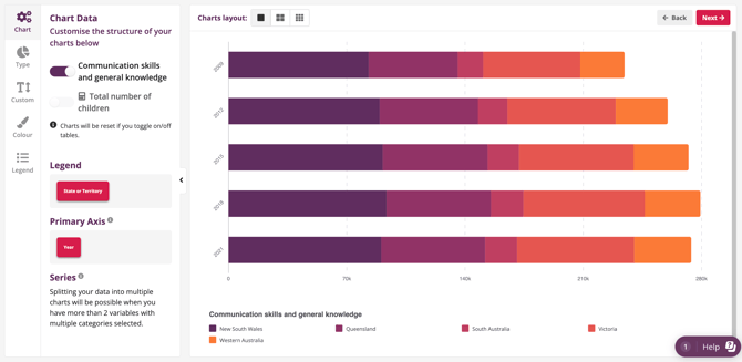
- Here is an example:
💡 Tips for Horizontal bar stacked chart
-
Shows composition + total: Horizontal stacked bars allow readers to understand both total value and category composition at once.
-
Use when category labels are long: Better than vertical stacked when category names are long or you have many of them.
-
Beware hard-to-compare segments: Only the first segment in each bar aligns easily so avoid using this chart if precise comparison of internal segments is critical.