
Donut charts are circular charts used to show how parts contribute to a whole. They’re similar to pie charts, but with a central hole that can improve readability and allow for layered comparisons using multiple rings.
When to Use a Donut Chart
Use a donut chart when you want to:
-
Show the percentage or proportion of categories within a whole.
-
Compare several totals side-by-side using multiple rings or separate charts.
-
Highlight key categories in a compact, visually engaging format.
⚠️ Donut charts are best for showing broad differences rather than precise comparisons. Avoid using too many categories in one ring, as it can quickly become cluttered or unreadable.
🔧 How to Build a Donut Chart
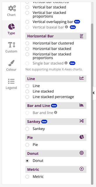
Step 1: Select the Donut Chart Type
In the Explore Data tool, go to Build Your Chart.
-
Under the Type tab, select Donut.
Step 2: Add Your Variables
In the Chart tab:
-
Choose a Category Variable to define the segments of your donut. Each unique value will appear as a slice.

Step 3 (Optional): Add a Series for Comparison
- If your chart table contains two or more multi-category Variables, you can drag a Variable into the Series section. This will split your chart into multiple Donut charts based on the selected Series Variable.
-
This creates multiple donut charts, one for each group, making it easier to compare proportions across them.
🧠 Tip: Use no more than 5–6 segments per donut for clarity. If you have many categories, consider using a bar chart instead.

Need help deciding which bar chart to use? Check out our visualisation selection guide.