
📊 Horizontal Bar Charts
Horizontal bar charts are ideal for comparing values across categories, especially when category names are long or you want to improve readability. They’re commonly used for ranking, breakdowns, and part-to-whole relationships. Each variant supports a specific use case, from grouped comparisons to stacked compositions.
Below are the horizontal bar chart types available in the platform, along with guidance on when to use each one:
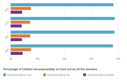
🔹 Horizontal Bar Clustered
Displays multiple series side-by-side for each category. Great for comparing values across different groups where space is constrained vertically.
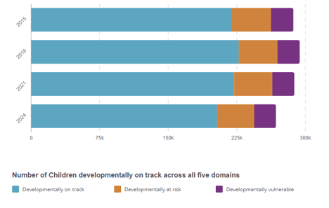
🔹 Horizontal Bar Stacked
Stacks data series horizontally to show cumulative values while highlighting the contribution of each segment.
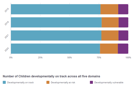
🔹 Horizontal Bar Stacked Proportions
A 100% stacked horizontal bar chart. Each bar totals to 100%, showing relative percentages between components in each category.
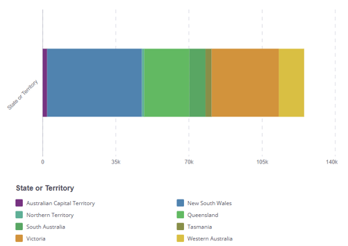
🔹 Single Bar Stacked
Visualises multiple segments within a single horizontal bar. Useful for showing progress, capacity usage, or breakdowns within a single category or total.
✅ When to Use Horizontal Bar Charts
-
To compare category values with long labels
-
To display rankings or sorted values
-
To show part-to-whole relationships horizontally
-
To present grouped data in a layout optimised for readability
Need help deciding which bar chart to use? Check out our visualisation selection guide.